DNB – Internship project
Making color tokens easier to choose with the help of an interactive Figma guide
Date and duration
April 2025 / 3 Weeks
Client
DNB UX design team
Team members
Co-Intern Troy Eriksen and myself
As part of our 8 week internship we completed a self-determined project in the last stages of our stay. There were many exciting ideas but we estimated that this one could create the biggest impact for the design team we were working with.
Design system
UI design
Prototyping
In-house project
Modes
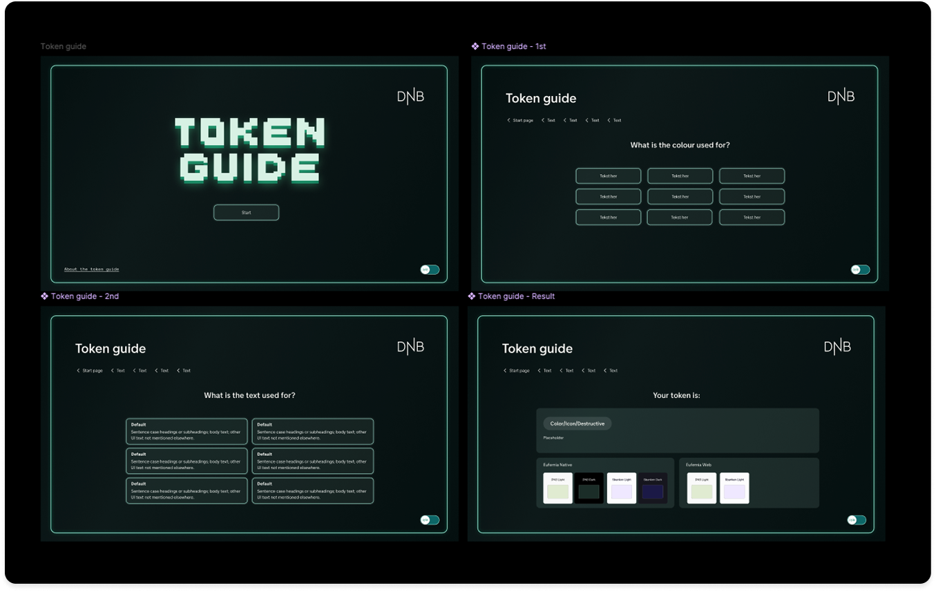
The challenge and the goal
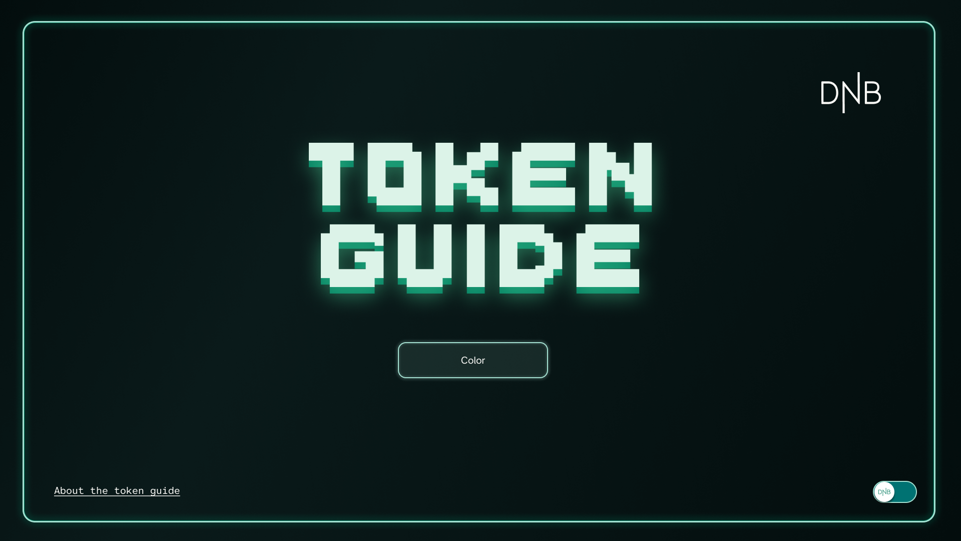
Early in the process, during our onboarding in the DNB Figma documents, we came across a relatively new token guide within the Eufemia Foundation folder in Figma. The initiative had started with our mentor, and we understood it as an interactive way to determine which color token should be used for various interface scenarios. As beginners in the complex design systems at DNB, we realized that it could take time to become familiar with all the different choices one must make to work efficiently and quickly.
In addition to discussions with our mentor, we had a conversation with an iOS developer where the work of changing older pages already in production to the defined platform-independent tokens made us particularly aware of the specific advantage this could have for developers in the process.
Documentation like this can also have a lower threshold for internal use compared to text-heavy pages.
Our experiences during the first weeks, and the feedback we received, told us that this was a project that could be of great help to the designers and developers at DNB, and it was something they were already sharing externally, so there would be no issue with including it in our portfolios. Based on these factors, we began to dedicate time to it as our main project.
Process and roles
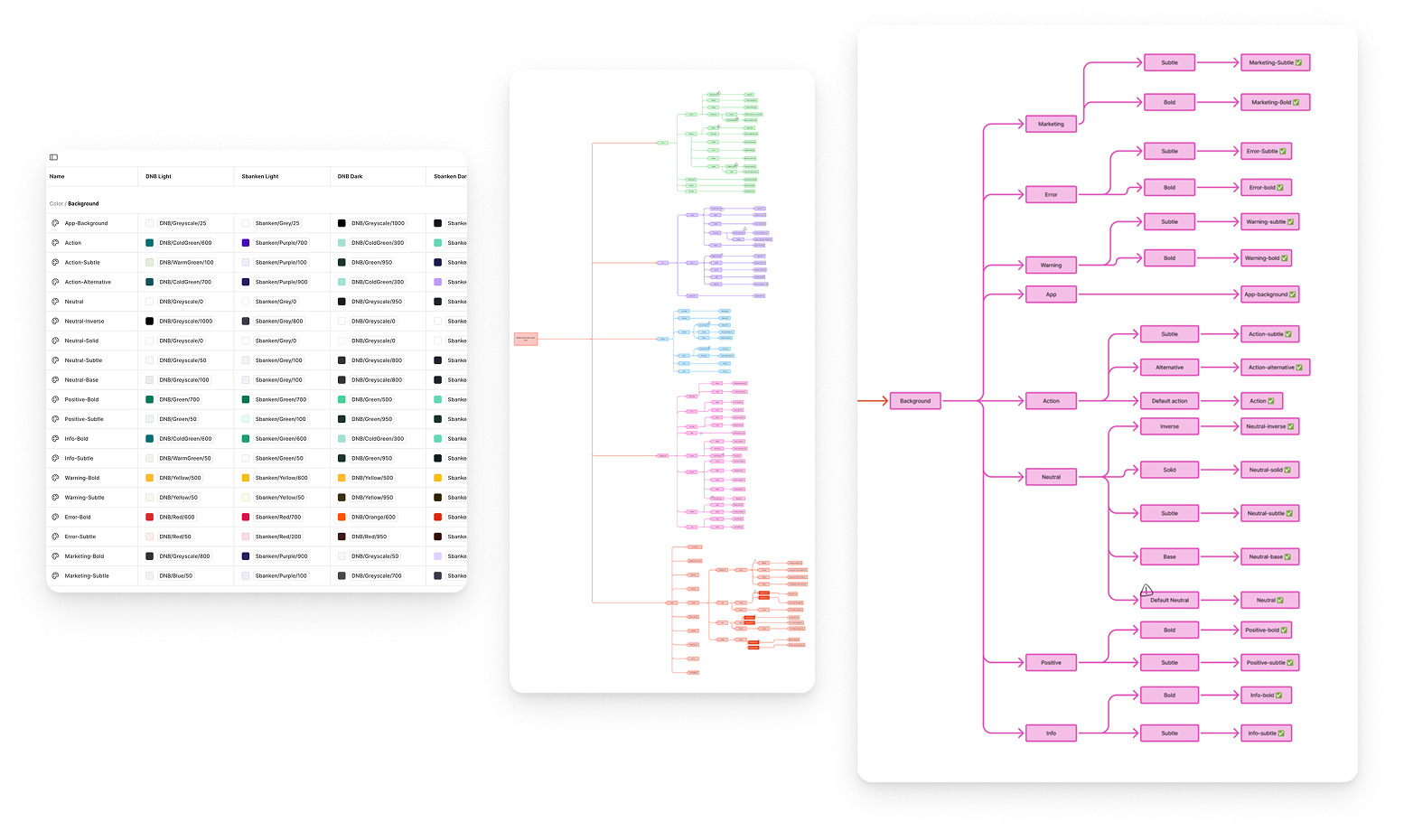
This project was the first where my co-intern and I divided roles based on our strengths. My co-intern was responsible for mapping the existing tokens and creating a clear flowchart of them, in addition to the toggle function in the Figma prototype we created and the prototype connections that ensured it was fully interactive.
My focus was on design choices, design system, components, and filling in content based on a combination of existing documentation and online sources of established terms.
Our mentor had mentioned that he had taken inspiration from a similar solution that Atlassian has, so we looked at that as well. For a while, we wondered if there was a way to create a more technical solution in Figma, but we ended up with a very straightforward manual solution with pages for each part of the interactive prototype.
Design choices
In our design process we were highly encouraged to think beyond the DNB design guidelines, so even though we didn't feel the need to stray far away from the already started guide, we ended up with new main design, inspired by the Token namesake – Arcade tokens, with a hint of DNB.
As we were building the internal design system for this tool ourselves, we took advantage of the learning-opportunity to use modes within the solution, and used a mode-toggle for an extra design version.
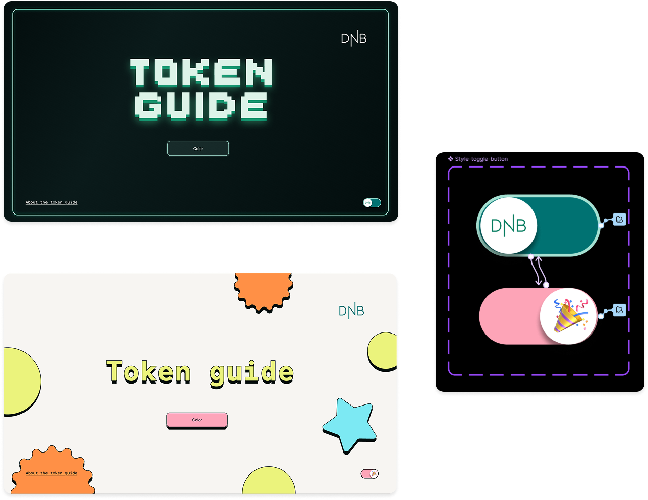
It was also a nice way to illustrate how convenient it can be to have tokens with different modes predefined for prototyping work. We felt that we might not have shown enough creativity in our original concept, so I started working on a "fun" version inspired by a neo-brutalist UI trend I had seen a lot of online recently. All elements were present in a single prototype; they were just set to 0% appearance/opacity when the opposite version was active.
Final prototype
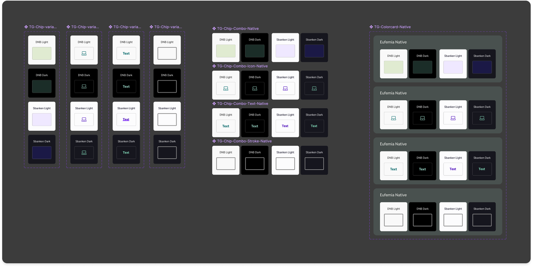
The Component setup is pretty self explanatory, We have a template background, Simple button, button with detail, and they are gathered in seperate page templates like shown below.
Within the token-example-chips – we have the different mode variants set from component level. Because of scope we had our main focus on DNB and Sbankens light and dark mode, but we also made components for Web.
You can choose whether or not they are versions that demonstrate a color fill, icon color, text or stroke color.
What we made for this guide was a usable tool. It was made to hopefully grow over time with the DNB team, with all the elements to be able to expand beyond color tokens.
We presented the final prototype for the team and got a very positive response. Of course it would hope to be helpful as what the tool is, but they responded well to the toggle feature, which shows how modes in Figma work in a very simple manner.
Or via embedded file below.