Nasjonalmuseet
Improving user experience by testing and adjusting information architecture
Date and duration
2024 – 4 Weeks
Client
Student assignment
– Kristiania Fagskole
Team members
Madelyn Galiza Butay, Ingrid Nytrøen and myself – Student group

A student group project to analyze and redesign the information architecture for the National Museum's website, focusing on their extensive collection of over 400,000 artifacts.
Information architecture
User testing
User journeys
Card sorting
Tree testing
Site map
Prototyping (lo and hi fidelity)
The challenge and the goal
At the beginning no specific issues were laid out for us and our first impressions were that this is a well thought out and beautiful website, but through research we were able to pinpoint where there were room for improvement, specifically to enhance navigation and access to the museum's digital collection, which was set as a focus area.
Note: This was a study assignment without any direct collaboration with the museum itself, and we were not able to contact visitors on-site.
Our goal was to make sure visitors to the site could find the information that they needed or wanted to find, easily.

Nasjonalmuseets Hero page today (no affiliation)
Team dynamics
My main role in the group was to be on top of documentation in Figjam. Information that came in during the process was sorted first into fases based on the Double Diamond, then sections based on different types of research. This and a specific work log for each session helped us stay organized and up to date on where we were in the process.
The progression and collaboration in the team went well, we set guidelines up front and made sure to respect each other by contributing and communicating well, but also to keep the work within a realistic work schedule.

Cropped view of the Figjam board used in our project
Link to Figjam boardResearch and insights
Customer research:
Noting the objectives of the museum itself – to appeal to and engage a wide audience. Their target audience. ChatGPT-generated SWOT-analysis that showed opportunities through digital development and tourism and that a threat could be the change of consumption of art and culture towards more digital.
Field research:
Myself and another group member took separate trips to the museum on different times of day to make notes of the types of visitors, the grouping of artifacts, the mood, wayfinding, etc.
Archetypes:
We decided to create archetypes to help us empathise with the potential users over personas, I have gotten the impression that archetypes are more and more used in ux research because it is more inclusive in who might fit within the grouping, I feel that stops us from being too narrow when considering a user’s experience. We decided on our archetypes by analysing field reasearch, our own experiences, ChatGPT- and online research about a realistic museum audience. The archetypes became: The creative student, The culturally interested senior and an international tourist.
We also did online research, a content audit of the existing website and a competitive analysis.
User Journey
We made two user journeys for our archetypes, the creative student and the culturally interested senior. We wanted to understand the users perspective, identify their needs and painpoints:
The creative student has received a school assignment, they have to find information about a certain art history period, and in this case using Nasjonalmuseets website to do so.
The culturally interested senior often goes on museum visits when they visit central cities. The senior can find information about tickets and opening hours online, but the senior wishes to buy the tickets on-site. The Senior is excited to visit, but can experience fatigue during the visit.
Lo-fi prototyping and user testing
When we through an iterative process had defined our lo-fi prototype, we were able to test these with 3 people related to our archetypes.

Feedback from the tests was that the content and structure were understandable and that they found the website to be tidy and clear. Other findings we discovered and had to take with us further in the design of the prototype were:
– That there was a need for a home/front page button in the menu.
– The placement of tags on the works page could be reexamined.
– On the ticket page there was a need to add to an extra step of buying a ticket (removed calendar) and on the front page we ended up changing 'top 10' to only 'most popular works'.
We introduced these changes into a new lo-fi version, which took us further towards the start of a hi-fi prototype.
Design choices
In terms of colors, we had chosen a solid and trustworthy brand color in a muted midnight blue, and added bright star yellow as a secondary color – to bring it forward to youthful culture rather than it feeling like "banking". We also had an extra purple color which we thought would create extra variety and therefore interest for the visitor. These worked together with an understated foreground and two background colors.
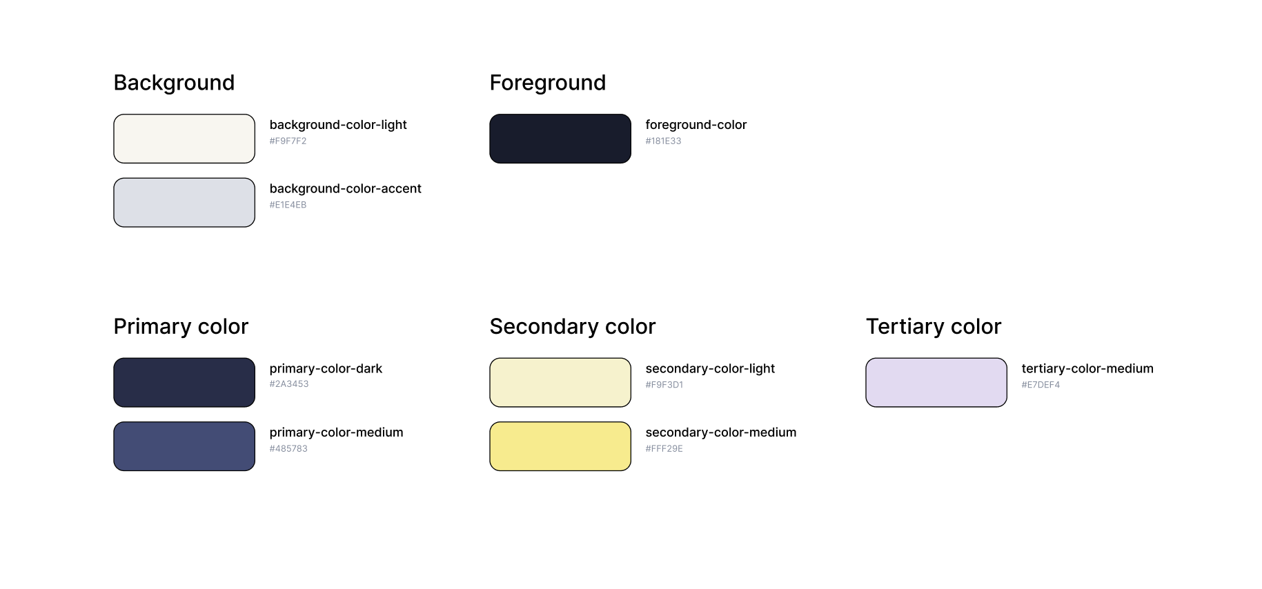
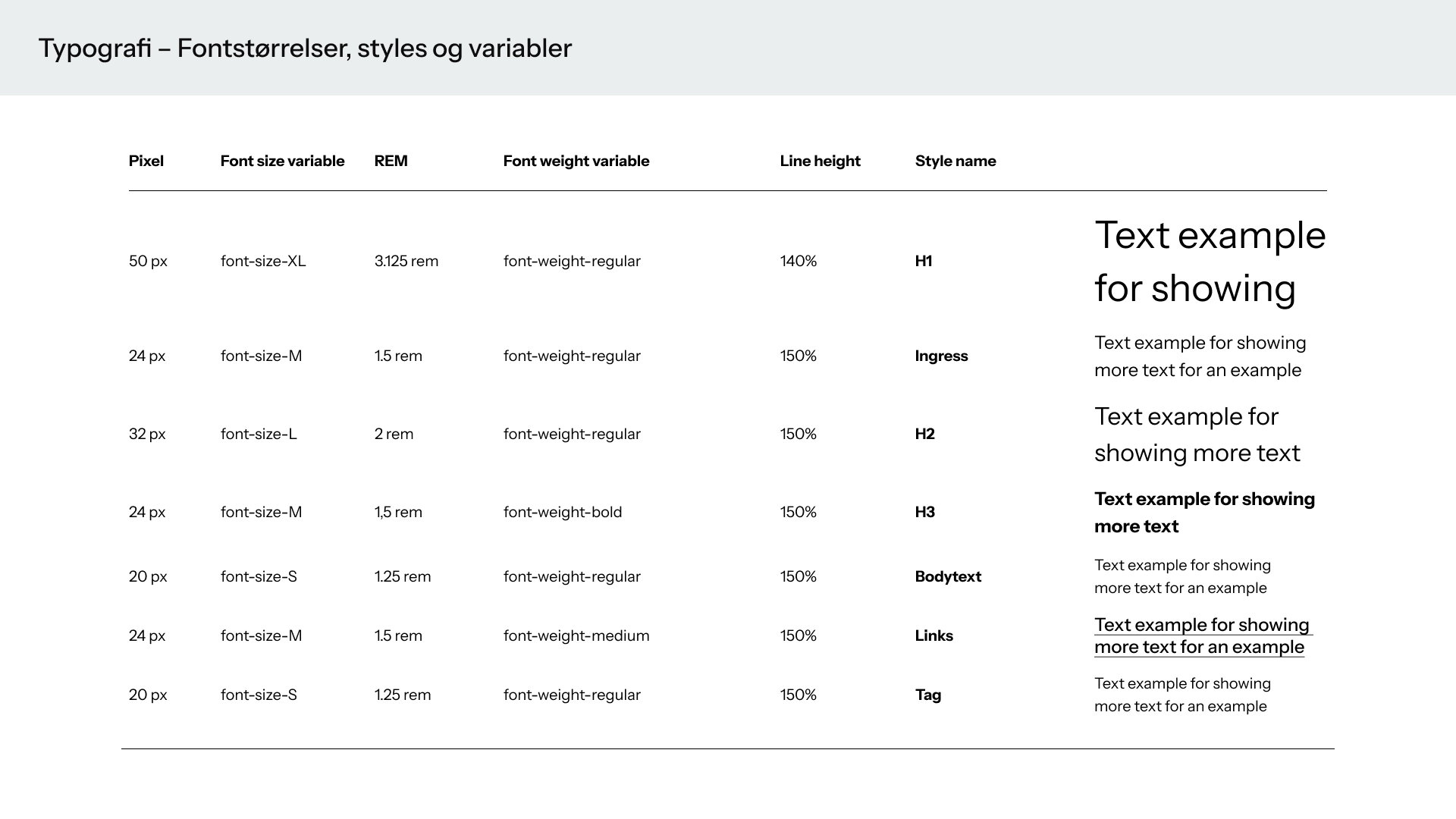
Our font choice eventually landed on Instrument Sans – It's a font none of us have used before, but when we compared it to a group of other suggestions we had put forward, it was the one we thought had the right feel – Serious but a little playful, a bit like how we have worked with the colours.
Final prototype
The topic of information architecture has led to a lot of learning and new experiences for everyone in the group. The project has been large with many elements to get used to and new challenges. Tasks such as archetypes, user journeys, tree testing and sitemap were something to brush up on for our group. The group had consistent conversations about design choices and process choices, such as choosing archetypes over personas. It was always important to us that the content and steps in the project were understandable to everyone in the group. And that everything in the process had a justification for why the various choices were made, and what value they had for the process's end result.
